COLOR PALETTE DEVELOPMENT options
Below you will find a range of color palette directions for your brand.
I’ve included both more complex palettes and simplified options to give you flexibility depending on how you want to build and use your visuals.
The more complex palettes allow room for 2-3 additional secondary and accent colors, while the simplified palettes are designed to easily expand with 3-4 complementary accents. All palettes can also be used exactly as shown, but bear in mind the other colors will be included regardless once we land on a direction, and those will be shown to you before finalizing the palette.
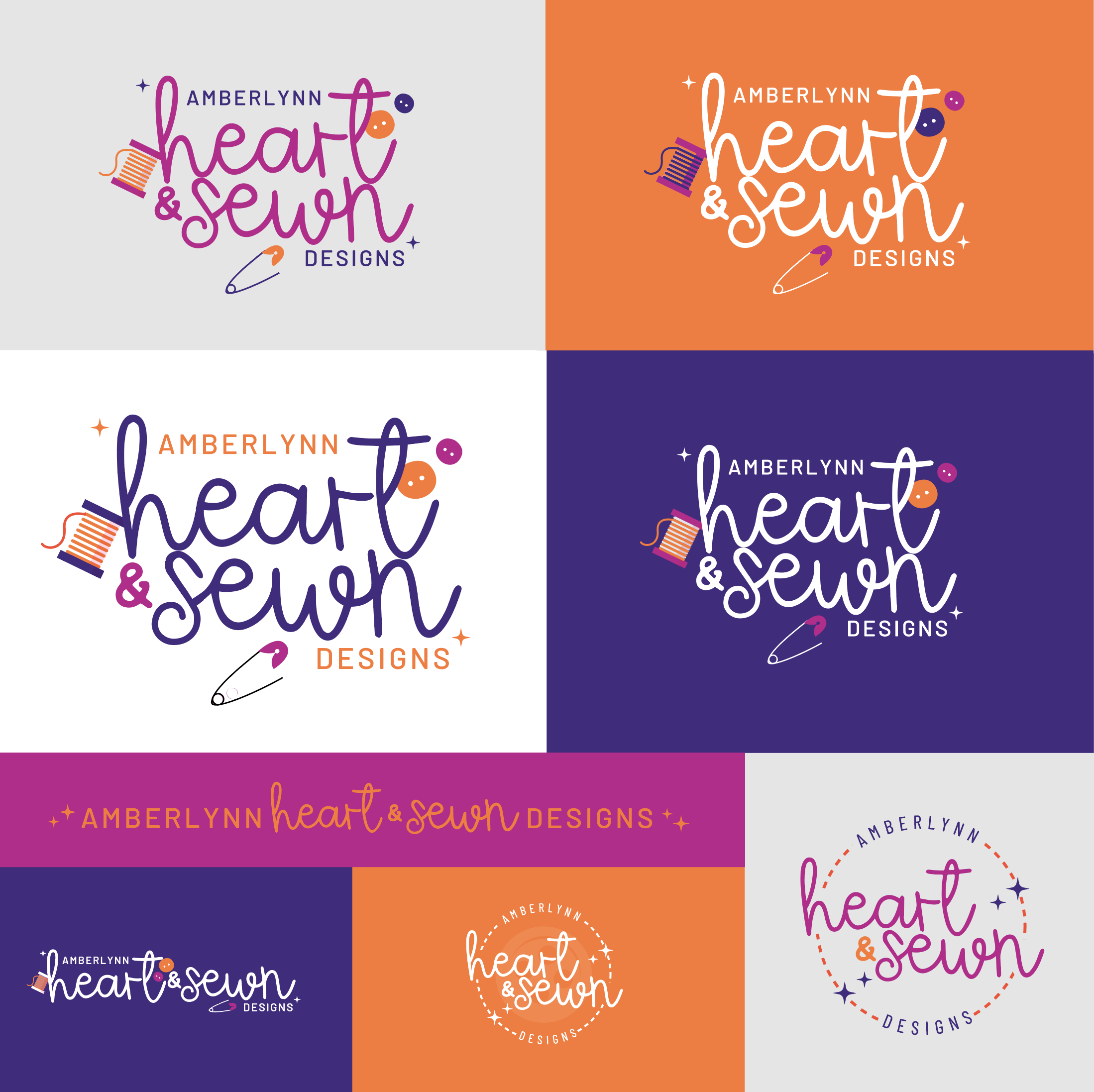
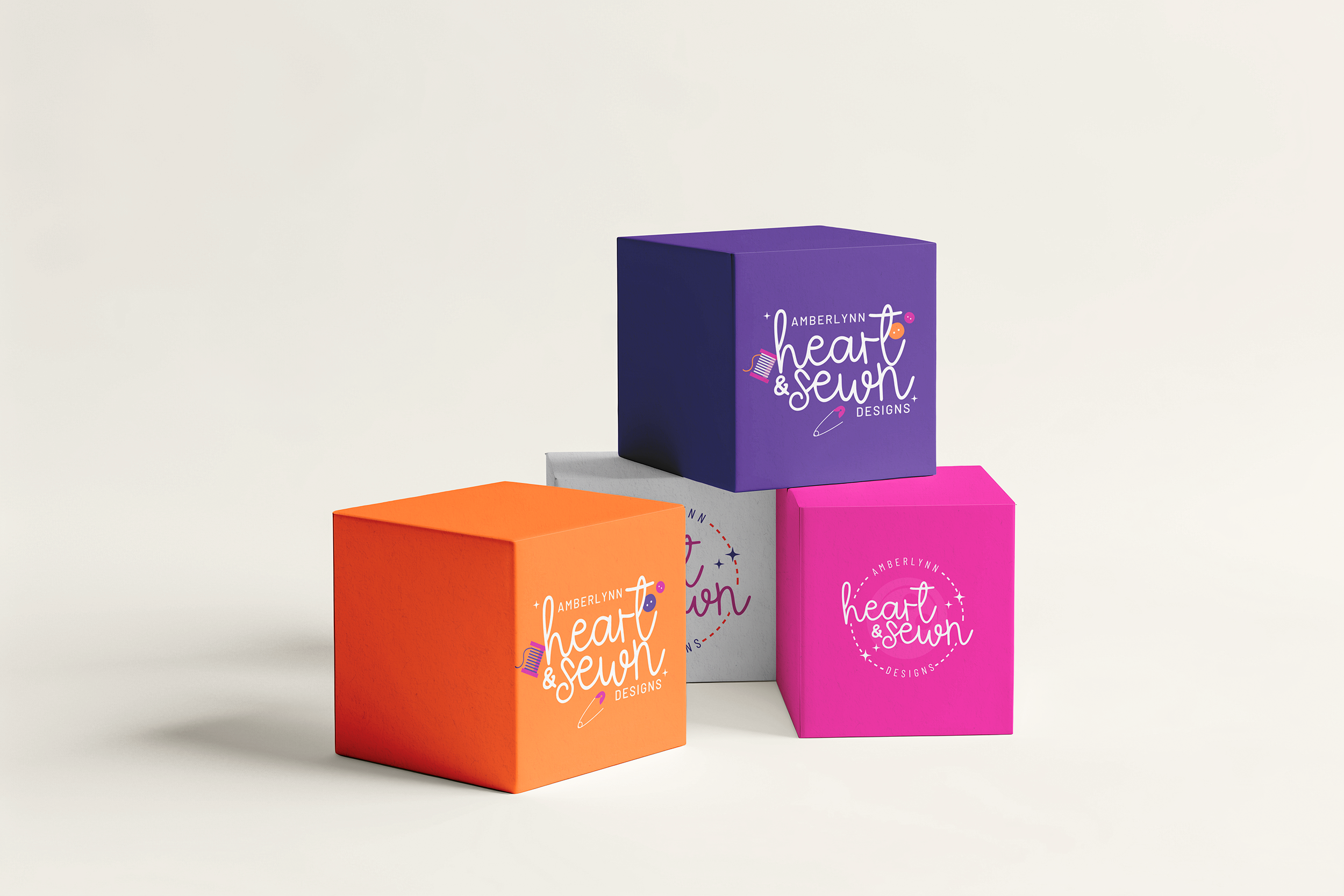
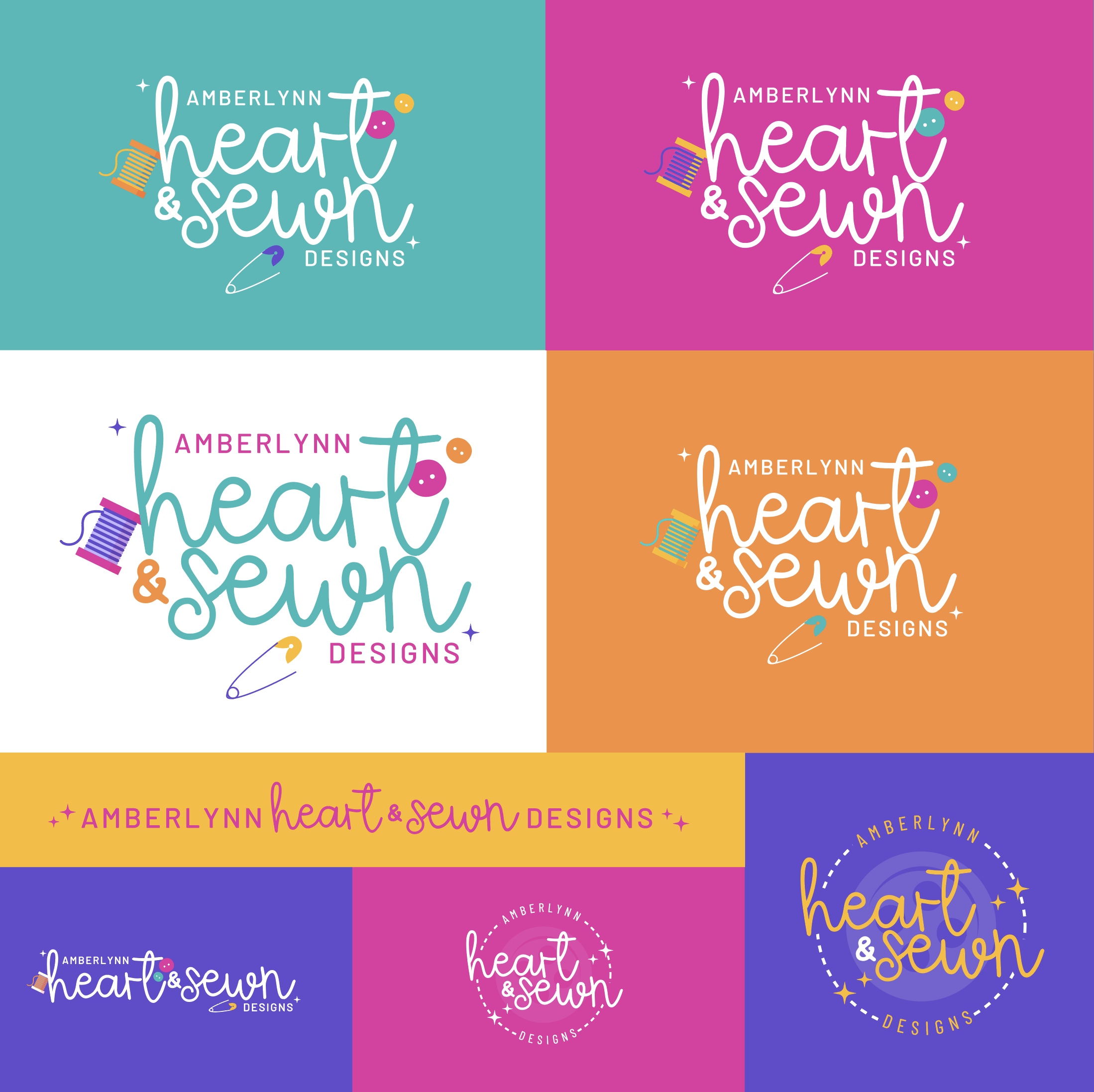
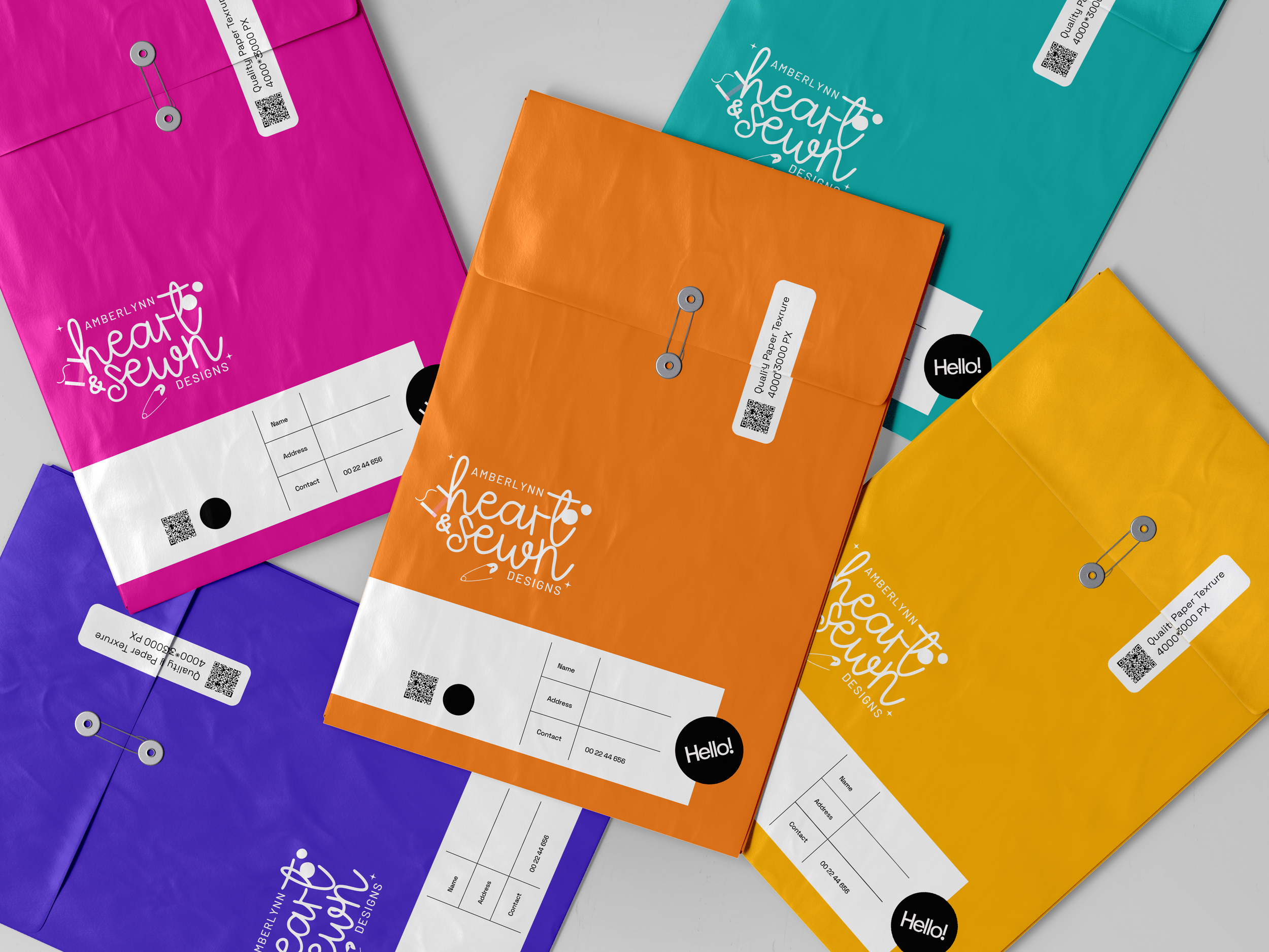
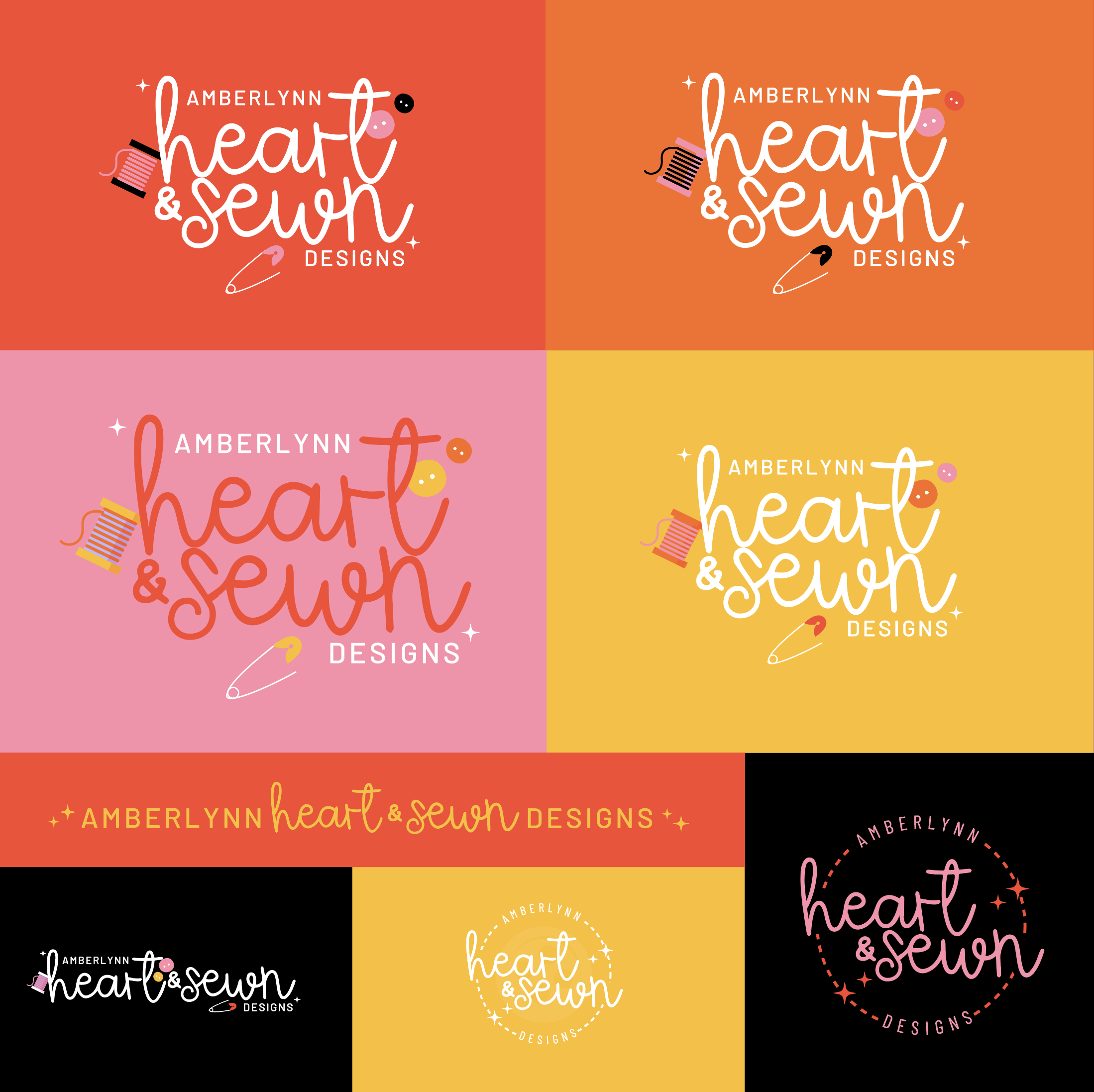
For each palette, I’ve included notes about the intent and overall feel, along with examples of the logo shown in different color configurations and balance variations. These examples are meant to demonstrate range, versatility, and how the brand can shift visually across different applications while still feeling cohesive.
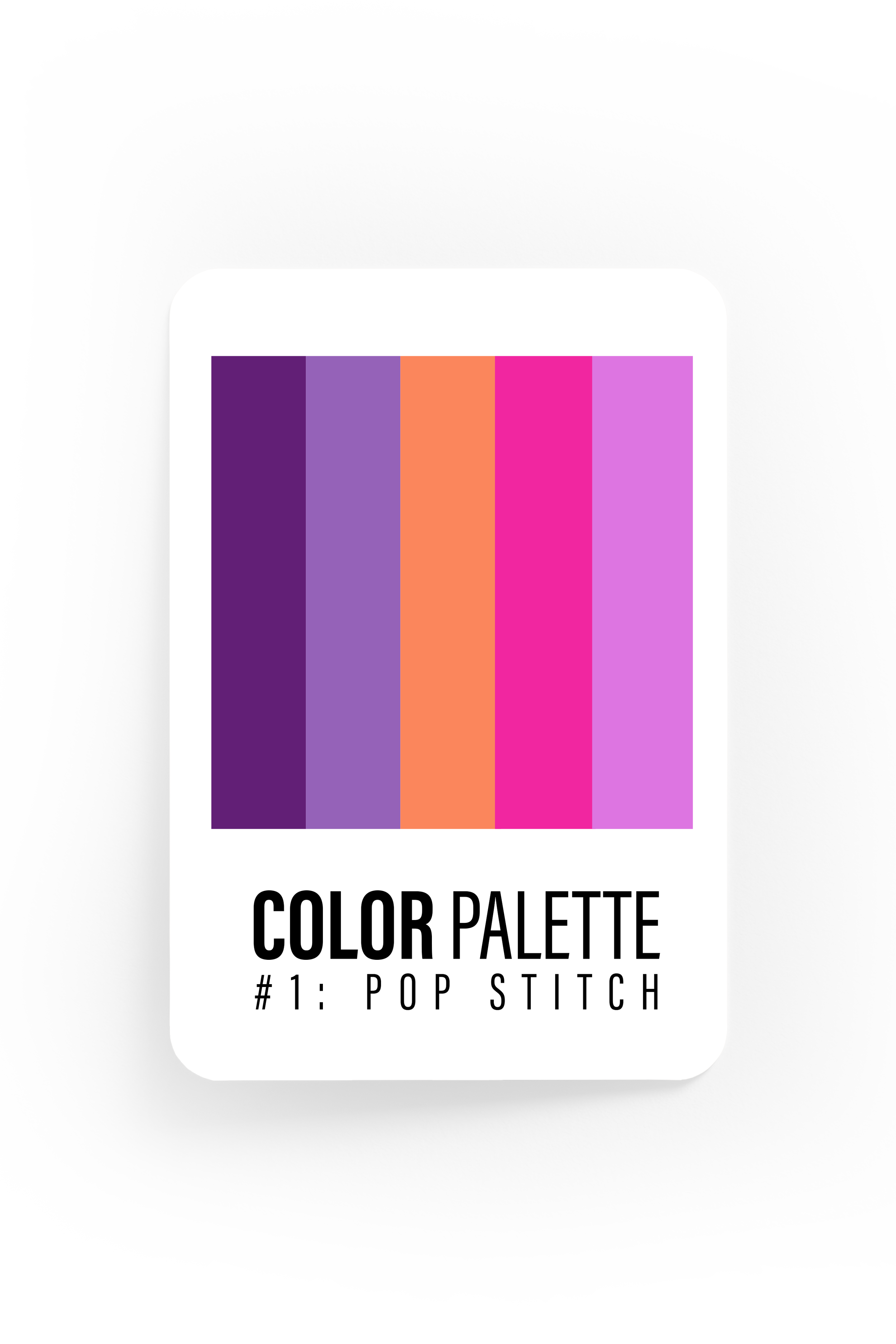
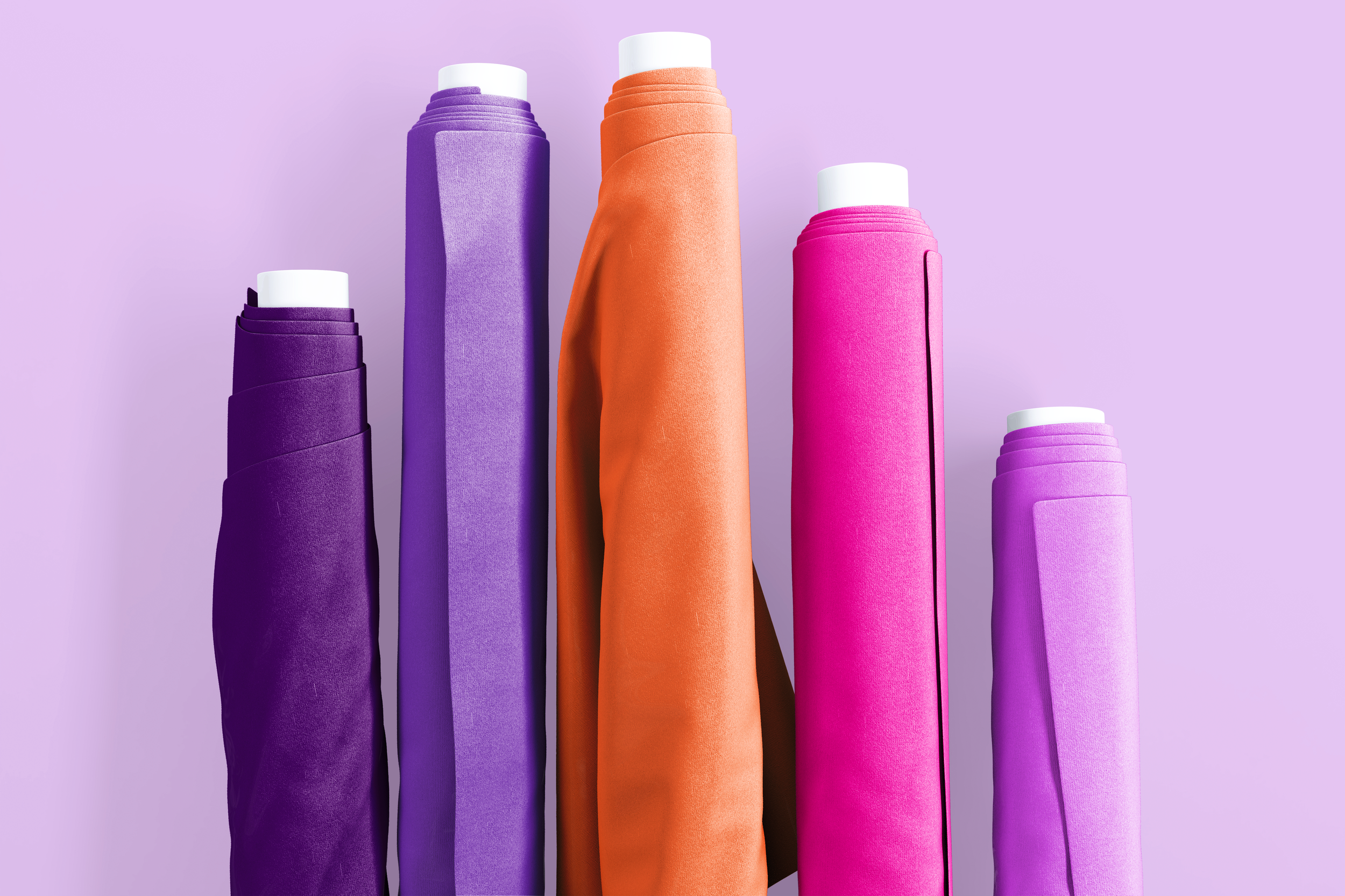
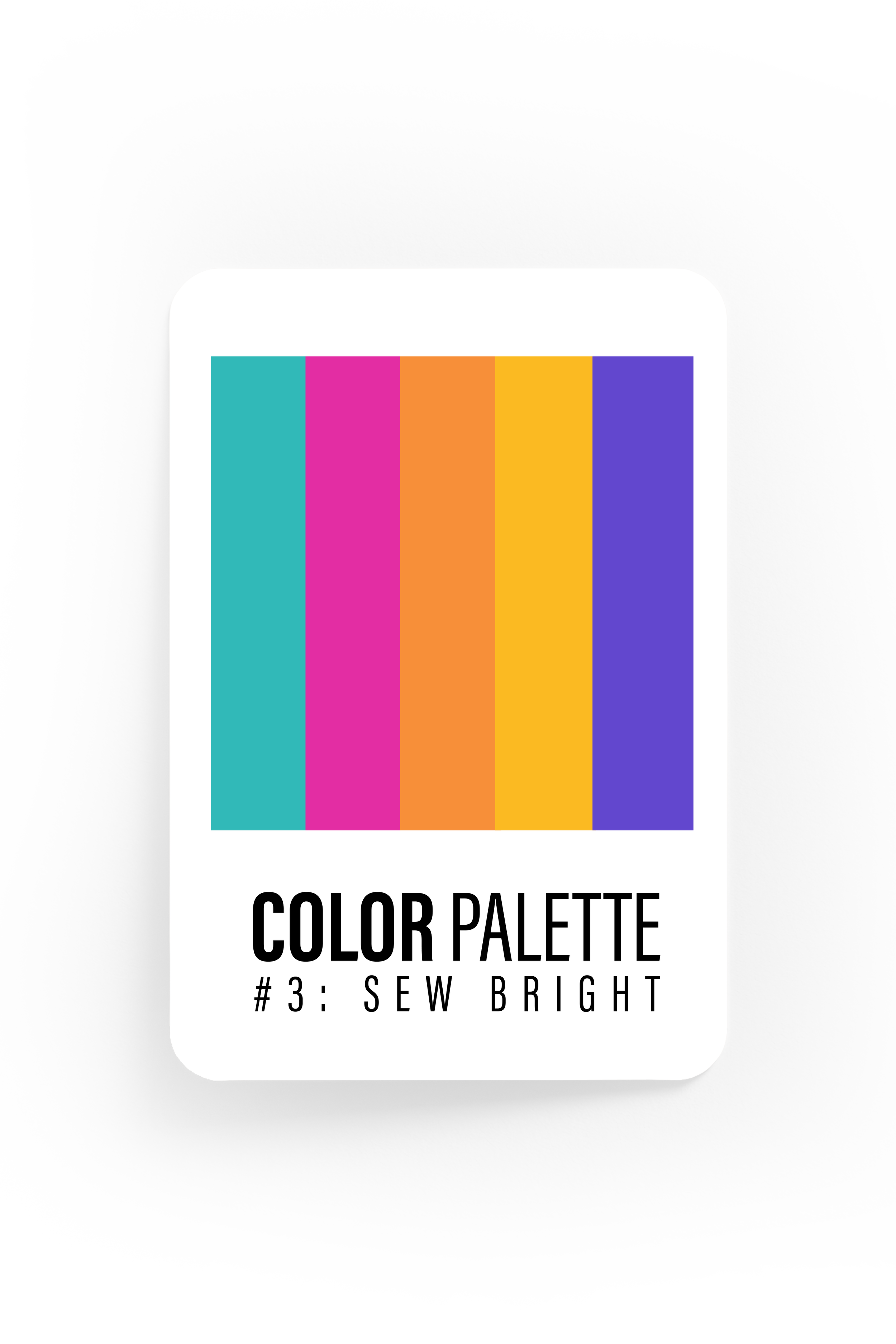
this palette is my top professional recommendation.
it is a bold, high energy mix built around contrast and personality. The mix of rich purples, vibrant pink, and warm coral/orange creates a playful but confident balance that feels creative and approachable. This palette is designed to stand out without feeling chaotic, making it especially strong.
Shown here in a more saturated balance, this palette can easily flex depending on how it’s applied. Leaning into the purple tones gives it a subtle feel, while emphasizing the pink and coral brings out a more personality. This palette works well across both bold statements and supporting elements, allowing the brand to shift tone while still feeling cohesive and recognizable.
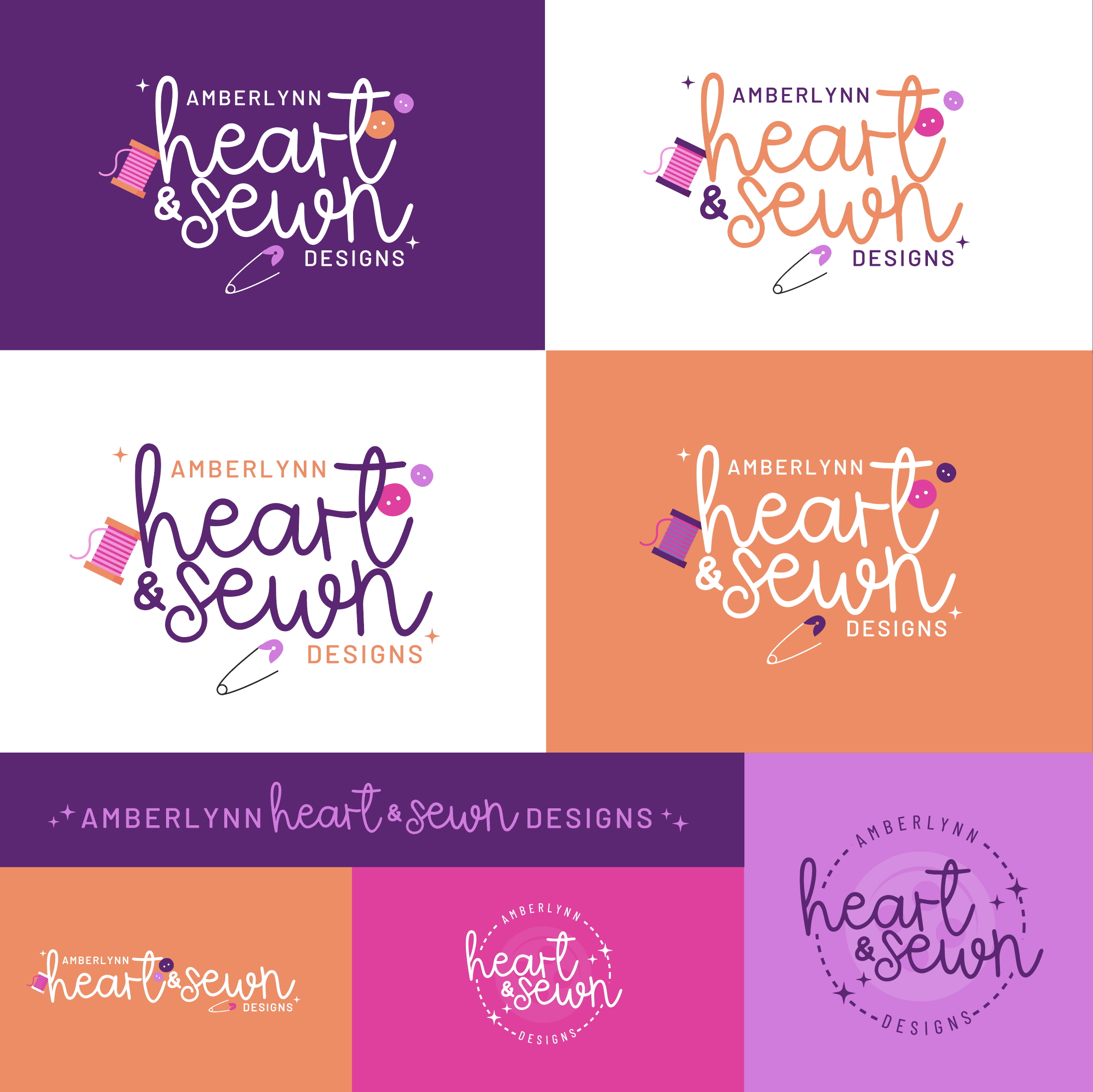
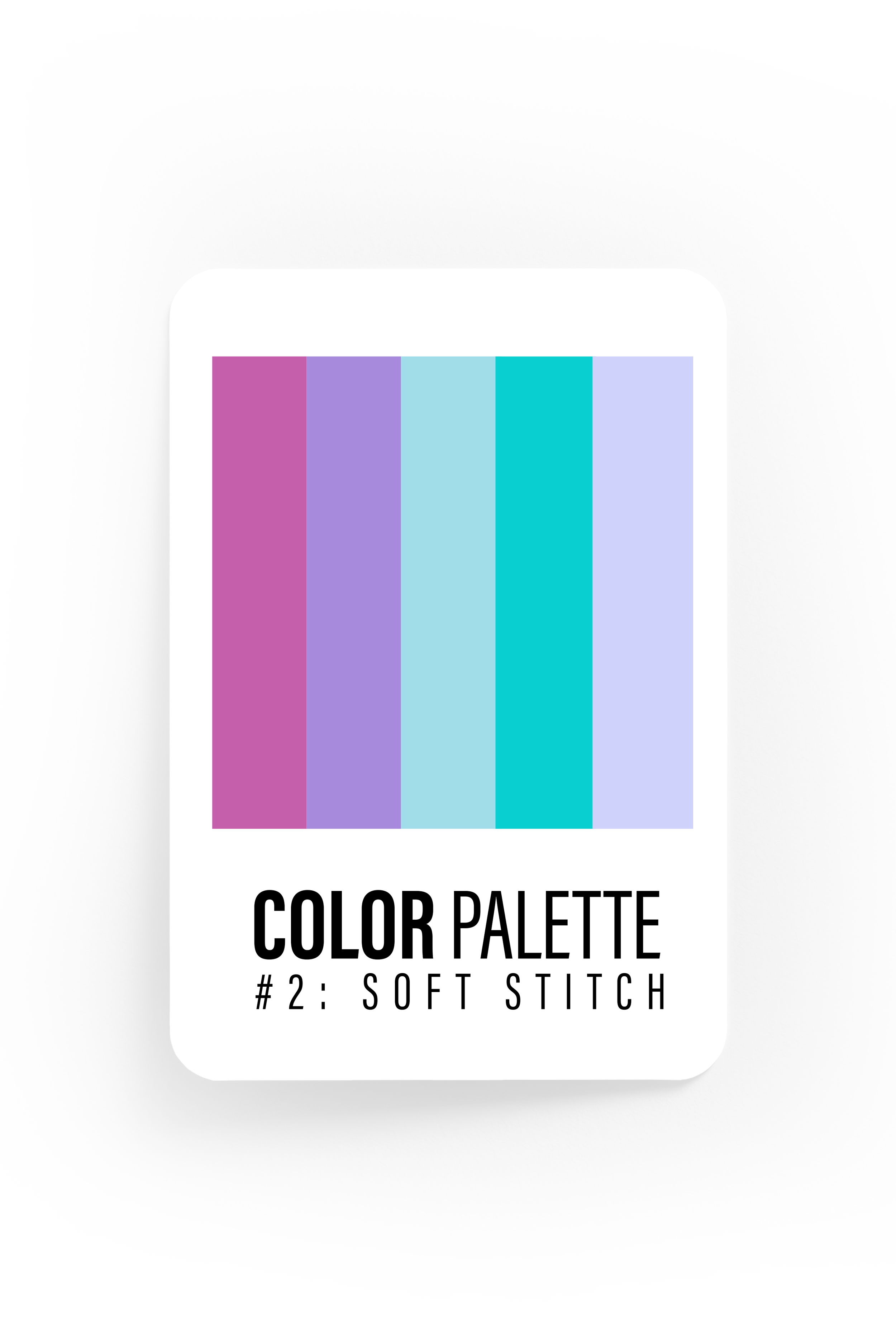
This palette is a softer option, built around pastel tones that feel light without fading into the background. It brings a friendly, modern energy.
Because the colors sit closer in value, this palette works best when paired with contrast through typography or layout. Shifting the balance between shades can make it feel either cohesive and calm or more expressive and fun, depending on how it’s used.
It’s a flexible option that works well for layered designs, social content, and accent moments, while still being strong enough to stand on its own if used as is.
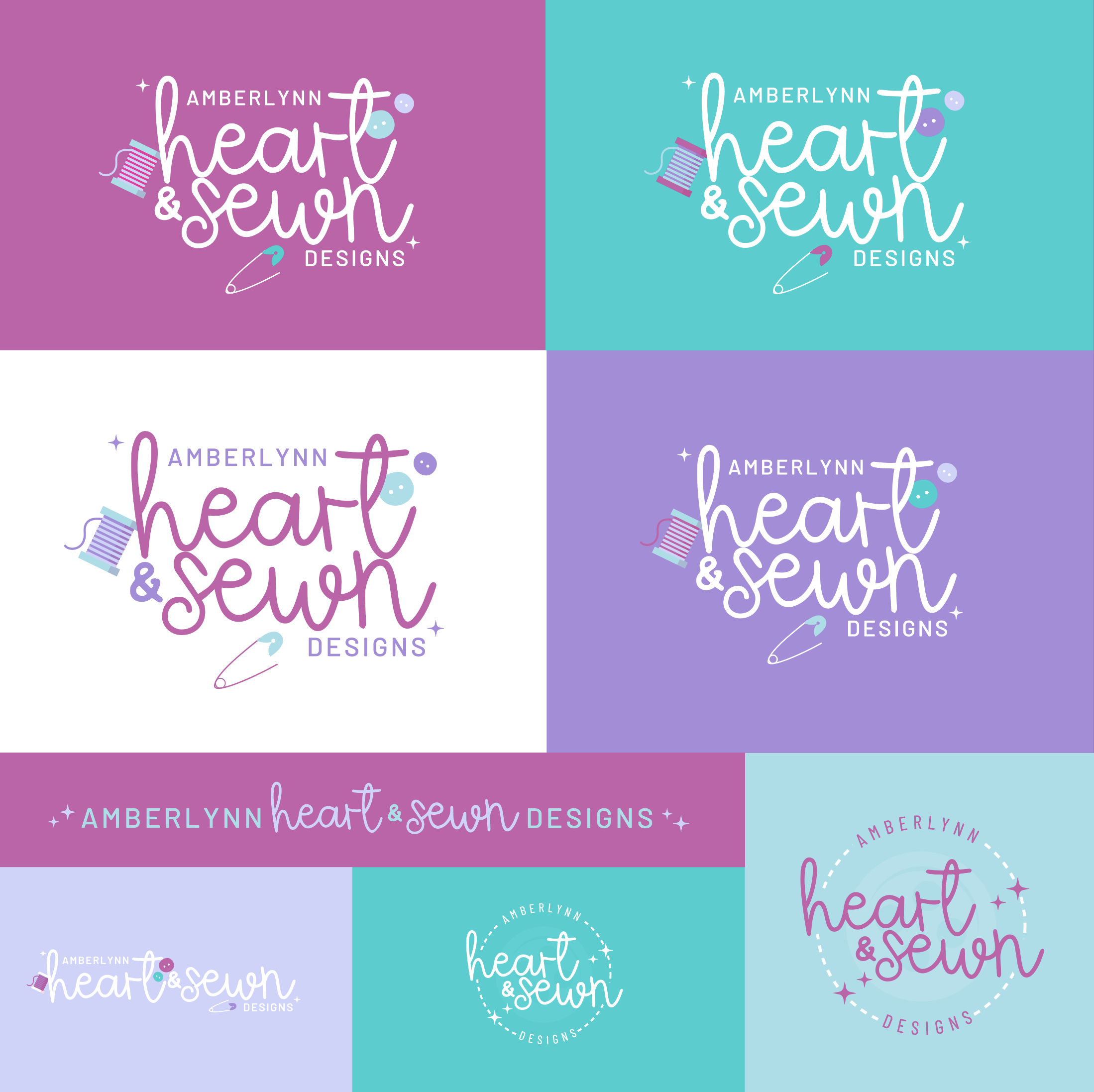
this option gives the most options in color variation for your logo.
This palette leans into vibrant, joyful color with a playful edge. The tones are bold and lively, creating an immediate sense of creativity and personality without feeling overwhelming or messy.
Because each color holds its own weight, this palette naturally creates visual contrast and energy. It works especially well when colors are rotated through different roles, allowing the brand to feel dynamic, expressive, or more balanced depending on how it’s applied.
It’s a versatile option that supports colorful brand moments, social graphics, and accent heavy layouts.
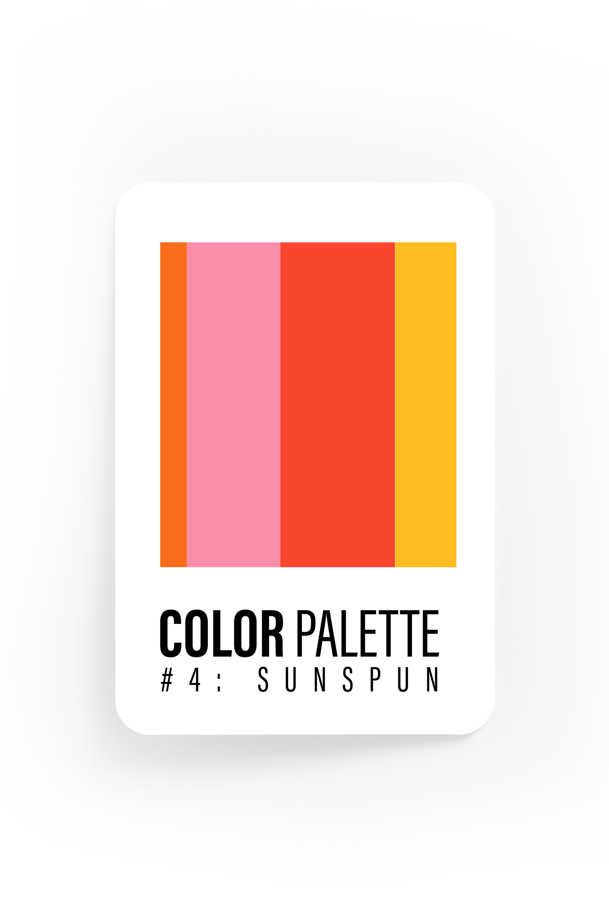
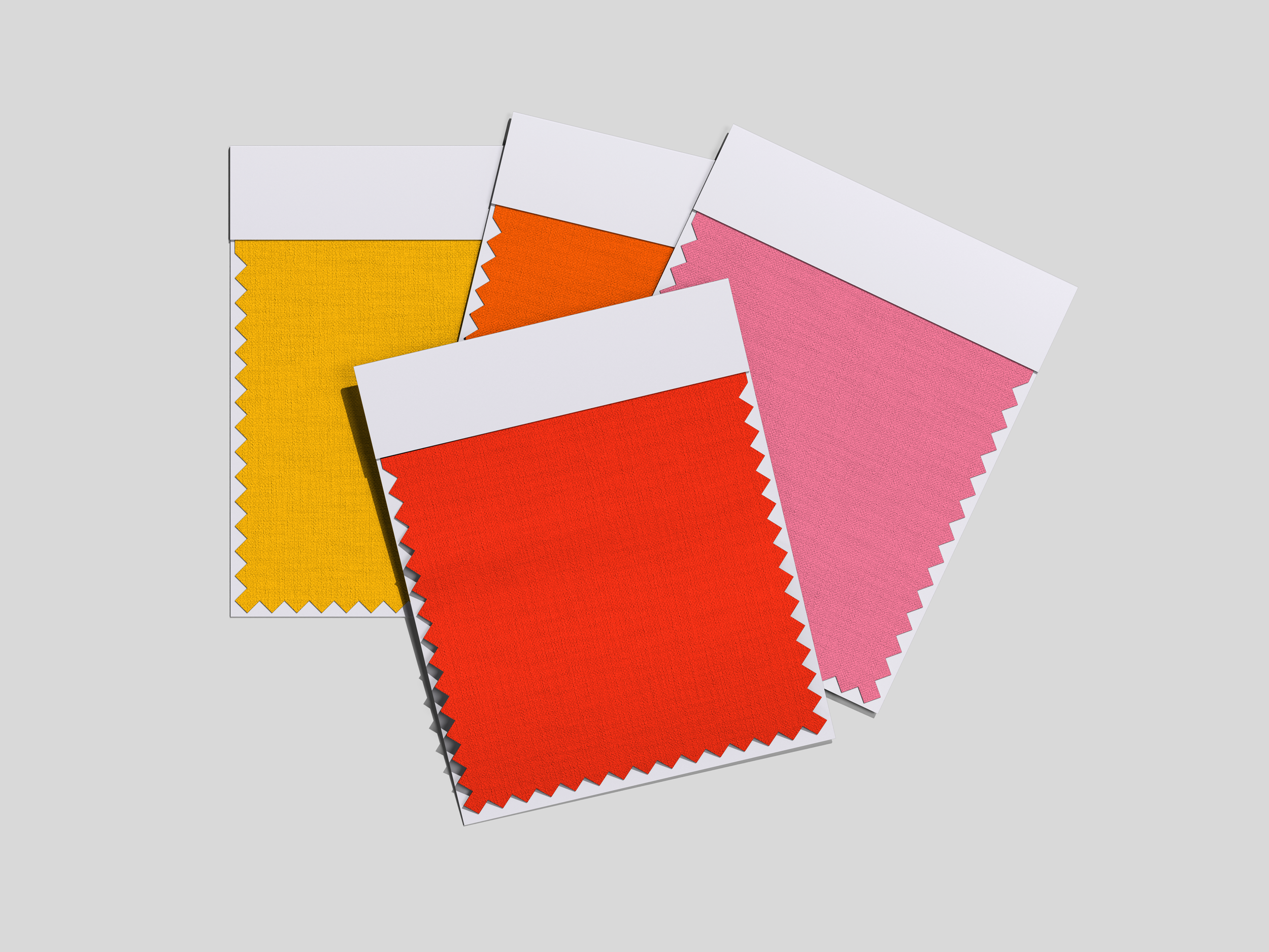
This palette is a simplified option built around warm, sun-driven tones that feel fresh, confident, and upbeat. While more streamlined than some of the other palettes, it’s intentionally designed to give the brand a strong, clean foundation at this early stage.
Because the colors are bold and warm, Sunspun works especially well when contrast is controlled through layout and typography. with black used only as a subtle accent, this is a palette where it fits naturally. As shown in the examples, small touches of black help anchor the brighter tones without taking away from the warmth.
Sunspun is a solid choice for a new brand. It stands well on its own now, while leaving plenty of room to introduce additional colors over time as the brand grows.
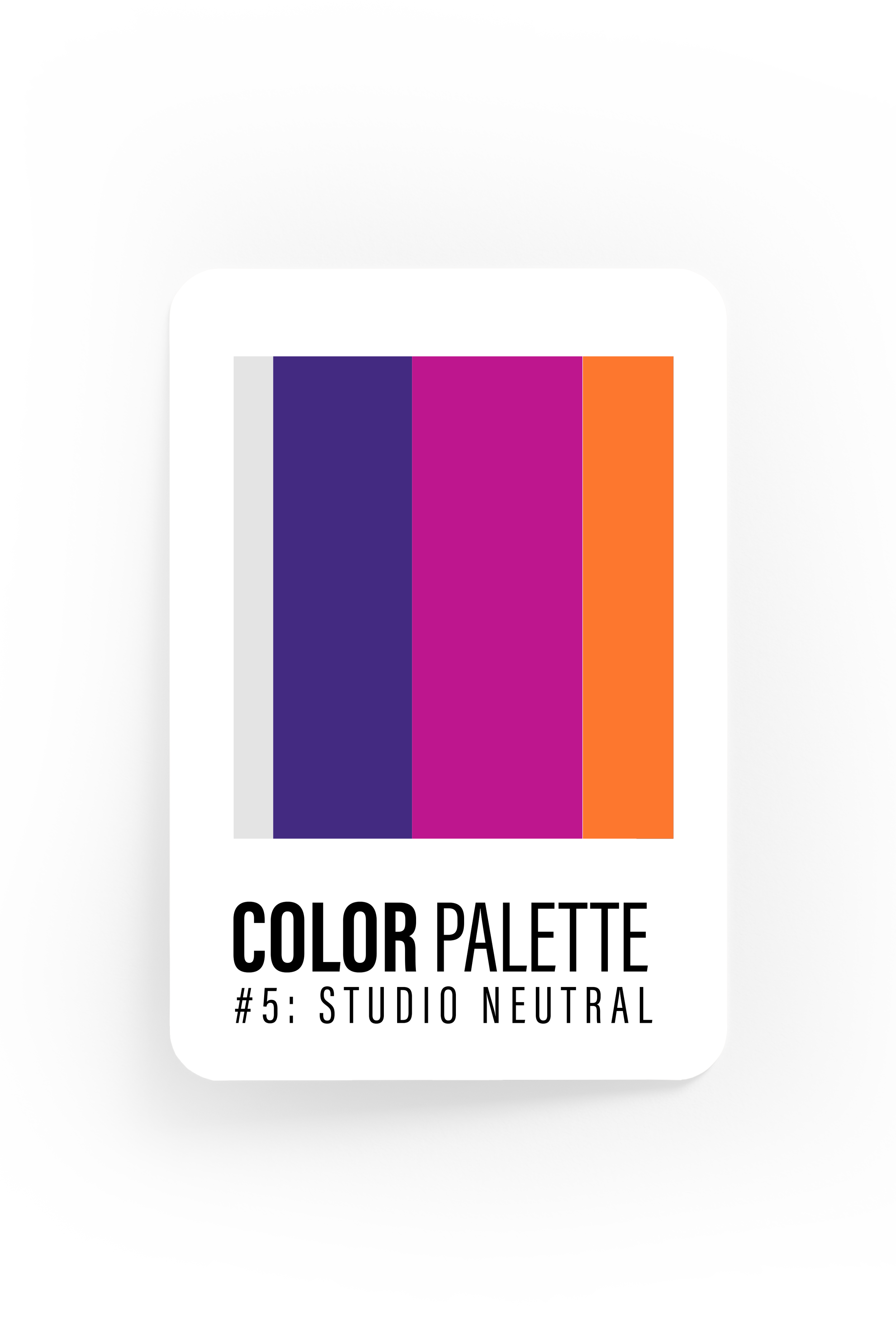
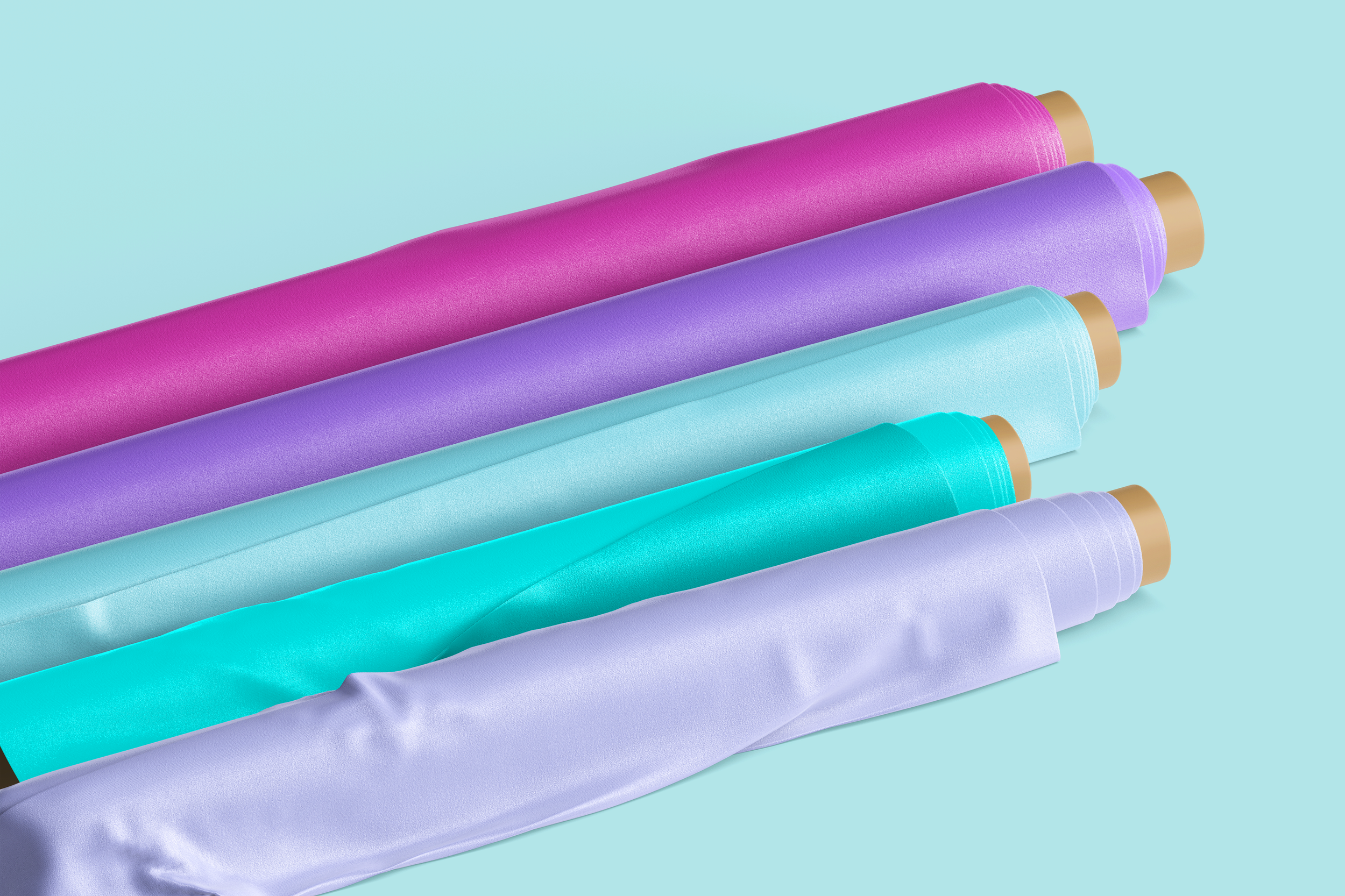
This is my SECOND top professional recommendation for your brand. It provides a strong, versatile foundation that feels modern, intentional, and easy to work with across all applications. The light gray base keeps the palette soft and refined, while still allowing the logo and supporting elements to stand out clearly.
This palette is especially effective for a fresh brand because it leaves room to grow. It works beautifully as is, but also creates space to introduce additional colors or accents in the future without needing a full reset. If you’re looking for something timeless, flexible, and highly usable long term, this palette offers the strongest starting point.